
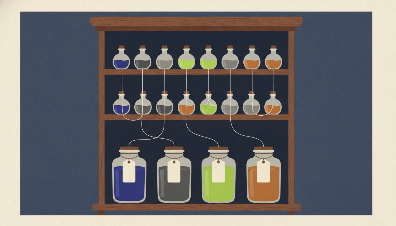
I am building a design system, and the part I keep coming back to is not the components. It is the hundred or so named decisions underneath them. Design tokens are the twenty percent of a design system that decides whether the other eighty holds together, and the part of them you actually have to understand fits in one careful read.
The picture to hold in your head
A design token is a design decision with a name: it is written down in one place and used everywhere else. "Body text is this grey." "The space inside a card is this big." "Buttons are this blue." A design system is the set of those decisions plus the components that use them. In Cascading Style Sheets (CSS), you usually write tokens as variables, --name: value, which CSS calls custom properties. Those variables are one output of the tokens, not the tokens themselves. That distinction is the whole foundation, and most token trouble comes from forgetting it.
The twenty percent worth understanding deeply is five things:
- A token is a decision, not just a variable.
- Tokens come in three tiers, or layers: raw values, the roles those values play, and optional slots for single components. A token may only point at the tier below it.
- Token names follow a fixed pattern, a naming grammar, not a list of one-off names.
- CSS variables have a few behaviours that make theming work, such as switching between light and dark, and one behaviour that quietly breaks it.
- The decisions live in one file, and the CSS is generated from it.
Everything else, the build tools, the sync with the design tool (such as Figma), the support for several brands, is the eighty percent you can add later without redoing anything, provided the five are in place. Every term in this post is also defined in the Glossary at the end.
A token is a decision, not a variable
The term comes from Salesforce, where Jina Anne, founding designer on the Lightning Design System, paired with engineering to architect and implement design tokens and to build Theo, the first tool that generated them. What that work established is that tokens are a way of working, not a feature of a stylesheet: the same decision, authored once, delivered to every platform that needs it.
The idea then spread to most large design systems, each with its own file format, until the industry agreed on one. In October 2025 the Design Tokens Community Group (DTCG), a group hosted by the World Wide Web Consortium (W3C) with editors from Adobe, Figma, Google, Microsoft, Salesforce and others, published the first stable version of a standard format for tokens. It is a community standard, not a formal W3C Recommendation, and tools such as Style Dictionary already support it.
The difference between a token and a variable is not where the value is stored. A variable is only the place where a value lives. A token is a decision: it has a name saying what it is for, a value, a type, and a life that outlasts any one stylesheet. A --gap: 12px written inside a card's rule is a variable. --space-3, one step of a spacing scale, is a raw-value token, called a primitive token. --color-text-muted, which names a role (quieter text, such as a date under a title), is a semantic token. The test is simple: would a designer recognise the name, and would changing the value be a design decision rather than a code change? If both are true, it is a token.
The same decision can be written in two places. In the source file it is a JavaScript Object Notation (JSON) entry, where $value holds the value, here a reference to another token. In the browser it is the CSS custom property generated from that entry:
{ "color": { "text": { "muted": { "$type": "color", "$value": "{gray.600}" } } } }
--color-text-muted: var(--gray-600);
In the CSS, var() reads the value of another custom property: var(--gray-600) means "whatever --gray-600 holds", and it is how one token points at another. The rest of this post shows tokens as CSS, for two reasons. The browser only ever sees the CSS, so that is where tiers, theming and the traps actually happen. And a new system can start in plain CSS and move the decisions into a file later, once they stop changing.
What earns a token is narrower than people expect. The categories below are what a system genuinely needs, and the third column is the honest answer to whether you need each one before shipping anything.
| Category | Examples | Needed on day one? |
|---|---|---|
| Colour | text, surface, border, action, status | |
| Space | the spacing scale, inset and stack sizes | |
| Typography | family, size scale, weight, line height | |
| Radius and border width | corner sizes, hairline | |
| Shadow | two or three elevation levels | |
| Motion | one duration pair, one easing | |
| Layering | a short z-index scale | |
| Breakpoints | two or three layout widths | , but not as a var() |
The examples use the usual role names of design systems. A surface is the background that content sits on, such as the page or a card. An action colour marks what you can click. Status colours report a result: success, warning or error. Inset is the space inside an element, between its edge and its content, and stack is the space between elements placed one above the other. In the other rows, a hairline is the thinnest border line. Elevation is how high a surface seems to float above the page, which shadows show. A duration pair is one short and one long animation time, and an easing is the speed curve of an animation, such as starting fast and ending slow. The z-index decides which element sits on top when two overlap.
Breakpoints are a real decision from day one, but media queries cannot read custom properties, so a breakpoint token is delivered by the build step (a variable in Sass, a language that compiles to CSS; a @custom-media rule, which gives a media query a name and which a build tool such as PostCSS turns into plain media queries; or the values written straight into the media queries), never as a var(). What does not earn a token is a one-off measurement that exists in a single component, or the arithmetic of a layout, such as calc(100% - 240px), a CSS function that does arithmetic, here the full width minus a 240-pixel sidebar. Tokens are decisions, and a decision made once, for one place, is just a value.
The three tiers, and the one rule between them
Tokens live in three tiers, and references only ever point down: a component token points at a semantic token, and a semantic token points at a primitive. This is the structural idea everything else depends on, so it is worth being precise about what each tier is.
The primitive tier is the palette and the scales: every colour step, every spacing step, every font size, named by what they are and carrying no meaning. --blue-600, --space-4, --font-size-300. The number is the step's position on the scale, not its value: --blue-100 is the lightest blue and --blue-900 the darkest, with 500 usually in the middle. The hundreds come from font weights (100 thin, 400 normal, 900 black) and leave room to add a step later. Primitives are complete and boring, and components never touch them directly.
The semantic tier is where the decisions live. Each semantic token names a role in the interface and points at a primitive: --color-text-default, --color-surface-raised (a surface that sits above the page, such as a card), --color-action-primary, --color-border-focus, --space-inset-md. This is the only tier components are allowed to consume. It is smaller than the primitive tier, and it is the tier a theme redefines.
The component tier is optional. --button-background, --card-padding. A component token exists only when a component needs a documented slot that someone will override from outside. Take a promo banner whose background is the brand colour: a primary button inside it would disappear, so the banner sets that one button's background to the surface colour, and nothing else changes. A dark section is not such a case. Changing the look of everything in an area is the job of a theme, which redefines the semantic tokens instead. By default a component reads semantic tokens directly and has no tokens of its own.
The rule that keeps this honest: a primitive references nothing, a semantic token references a primitive (or, sparingly, another semantic token when that relationship is the decision, as in a focus ring, the outline that shows which element the keyboard is on, that should always match the action colour), and a component token references a semantic one. Never sideways within the primitive tier, never upwards.
| Tier | Roughly how many | Changes when | Consumed by components |
|---|---|---|---|
| Primitive | Hundreds | The palette or scale changes | No |
| Semantic | Dozens | A design decision or a theme changes | Yes |
| Component | A handful | A component grows an override need | Yes, by that component |
Two failures show up in nearly every system that skips this. The first is the primitive in disguise: --color-primary-500 used in forty components is a primitive with a hopeful name, and the day the brand colour changes you discover that "primary" meant six different things. The second is theming the primitive tier: making dark mode by flipping --gray-100 to a dark value means --gray-100 now lies, and every place that used it for its lightness rather than its role breaks. Themes redefine semantic tokens, never primitives, and making that possible is a main reason the semantic tier exists.
Naming is a grammar, not a list
Once there are tiers, the names have to say which tier a token is in and what it does, and the only way that scales past a few dozen tokens is a grammar: a name is a path of levels, read from broad to specific, with a fixed order.
The standard reference for this idea is Nathan Curtis's Naming Tokens in Design Systems. It covers more levels and many more examples than this post needs.
The levels worth adopting are these, in this order, each one optional but never reordered:
-
Namespace: a short prefix that keeps your tokens from colliding with a framework's. This site prefixes its own with
--pp-and lives alongside Infima's--ifm-tokens without confusion. (Infima is the CSS framework that Docusaurus, the tool behind this site, is built on.) -
Category:
color,space,font,radius,shadow,duration. -
Concept or property:
text,surface,border,action,inset,stack. -
Variant: which version of the role. Variants usually follow one of three lines:
- Emphasis:
primaryis the most important thing, such as the one main button on a screen;secondaryis for the other actions, shown less strongly;mutedis quieter, lower-contrast text or borders. - Elevation:
raisedis a surface that sits above the one beneath it, such as a card on the page or a menu over the content. - Intent:
dangermarks something destructive or an error, such as a Delete button, withsuccessandwarningbeside it.
All of them describe the job, not the look:
dangerstays correct if the brand's red becomes orange, andprimarystays correct when the brand colour changes. - Emphasis:
-
State:
hover,active,disabled,focus. -
Scale:
100…900,sm/md/lg, or a plain number. Decoded examples at the end of the post read many names level by level.
Two rules do most of the work. Semantic tokens are named by role, never by value, and primitive scales are numeric with room between the steps. Role naming is what lets a theme change a value without making the name a lie. Numeric scales with gaps (100 to 900, or a spacing scale of 1, 2, 3, 4, 6, 8, 12, 16) let you add a step without renaming its neighbours, which t-shirt sizes, names like clothing sizes, never allow: once you have sm, md and lg, the next size is xs or xl, and after that the scheme collapses into 2xl, 3xl and arguments.
| Name | Verdict | Why |
|---|---|---|
--color-text-muted | Category, concept, variant; says the role | |
--pp-space-inset-md | Namespaced, category, concept, scale | |
--blue-600 | Value-named, which is exactly right for that tier | |
--color-primary-500 in a component | A primitive pretending to be semantic | |
--gray-100 redefined by the dark theme | The name no longer describes the value | |
--btn-bg-hover-dark | Theme baked into the name; the theme is a scope, not a suffix |
:root {
  /* primitive: what it is (colours written with oklch(): lightness, chroma, hue) */
  --pp-gray-100: oklch(97% 0.005 270);
  --pp-gray-900: oklch(22% 0.02 270);
  --pp-indigo-600: oklch(50% 0.2 275);
  --pp-space-2: 0.5rem;
  --pp-space-4: 1rem;

  /* semantic: what it is for */
  --pp-color-text-default: var(--pp-gray-900);
  --pp-color-surface-default: var(--pp-gray-100);
  --pp-color-action-primary: var(--pp-indigo-600);
  --pp-space-inset-md: var(--pp-space-4);
}
The scales underneath
The primitive tier is mostly three scales, and each has one decision that matters more than the rest.
For space, the decision is the base unit: four pixels, expressed in rem. A rem is a CSS unit equal to the page's root font size, which is 16 pixels unless the reader changes it, so 0.25 rem is four pixels. Writing space in rem instead of pixels means the whole scale grows when a reader sets a bigger text size in the browser. The steps then get further apart as they get bigger: 0.25, 0.5, 0.75, 1, 1.5, 2, 3, 4 rem. The reason is how we see size. The eye notices a difference in proportion, not in pixels: 4 px next to 8 px is twice as big, while 60 px next to 64 px looks the same. So small steps can sit close together, and large steps must be far apart to look different at all. A linear scale, with the same gap between every step, produces sizes nobody uses and forces every layout to pick between two nearly identical values.
For typography, the decision is whether sizes are fixed or fluid. A fixed size is the same on every screen. A fluid size grows with the width of the window, between a minimum and a maximum, and CSS writes it with the clamp() function: clamp(1rem, 0.9rem + 0.5vw, 1.25rem) means "never below 1 rem, never above 1.25 rem, and in between grow with the window" (vw is 1% of the window's width). Each step of a fluid scale grows this way, smoothly and without breakpoints, and it is the right default for content sites. Line height, the distance between lines of text, is a number without a unit, such as 1.5 (1.5 times the font size), never a length such as 24px, so it grows with the size it belongs to.
For colour, the decision is the colour space of the primitives, the system of numbers used to describe each colour (older ones are red-green-blue, RGB, and hue-saturation-lightness, HSL), and the answer has changed recently. OKLCH writes a colour as three numbers: lightness, chroma (how strong the colour is) and hue (which colour it is). It is a perceptual space: it is built so that equal steps in the numbers look like equal steps to the eye. That gives ramps where each step is the same visible distance from the next, and a text and surface pair that passes the contrast check at one hue roughly passes at another. The contrast check is the minimum difference between text and its background that the Web Content Accessibility Guidelines (WCAG) require for text to be readable. The practical upshot is that a ramp is made by keeping the hue, stepping the lightness, and lowering the chroma near both ends, because very light and very dark colours cannot be strong on a screen. The numbers are readable by a human. A ramp built in hexadecimal codes, such as #4f46e5, has neither property.
In oklch(60% 0.2 275), the first number is lightness, from 0% (black) to 100% (white). The second is chroma, from 0 (grey) up to about 0.37; most colours used on screens stay under 0.25. The third is hue, an angle on the colour wheel from 0 to 360: roughly 30 is red, 110 yellow, 140 green, 265 blue and 330 magenta. The "OK" comes from OKLab, the colour model Björn Ottosson published in 2020, which OKLCH is built on. All major browsers support oklch() since 2023. Evil Martians' account of moving to OKLCH explains the change in detail.
:root {
  /* one hue, lightness stepped, chroma lower at both ends: a ramp you can reason about */
  --pp-indigo-100: oklch(94% 0.05 275);
  --pp-indigo-300: oklch(80% 0.12 275);
  --pp-indigo-500: oklch(60% 0.2 275);
  --pp-indigo-700: oklch(42% 0.18 275);
  --pp-indigo-900: oklch(26% 0.1 275);
}
The custom-property mechanics you cannot skip
With tiers, names and scales in place, the remaining foundation is how the browser actually treats a custom property, because the theming pattern in the next section depends on four behaviours, and one of them is a trap.
Custom properties inherit. Each element gets a custom property's value from its parent, unless it declares its own. This is why declaring tokens on :root makes them available everywhere, and why redefining one on a subtree, an element and everything inside it, changes every descendant. The Mozilla Developer Network (MDN) guide to custom properties covers the details.
The trap: an alias, a token whose value is another token, is resolved where it is declared, not where it is read. When --button-background: var(--color-action-primary) is declared on :root, the browser substitutes the reference at the root and the computed value, the final value the browser works out, a colour, is what descendants inherit. A section that later redefines --color-action-primary does not change the inherited --button-background, because that one was already a colour by the time it arrived. A reference between tokens is resolved at the element that declares it, so any alias you expect a scoped theme to affect must be declared inside the scope, or read directly in the component's rule. This is the single most common reason a scoped dark section shows a light button. The fix is to drop the alias from :root entirely, so nothing resolves it early, and let the component fall back to the semantic token at the point of use.
The same page, drawn as a tree, once with the trap and once with the fix:
A var() inside a custom property is calculated once, on the element that declares it, and children inherit the finished value; a var() inside a normal property such as background is calculated on every element the rule applies to. That difference is the whole trap, and the whole fix.
/* Trap */
:root {
  --color-action-primary: var(--indigo-600);
  --button-background: var(--color-action-primary); /* resolved here, once */
}
.banner[data-theme="dark"] {
  --color-action-primary: var(--indigo-300); /* the button never sees this */
}

/* Fix: no --button-background on :root; the component reads the
   semantic token where it is used, and the slot stays optional */
:root {
  --color-action-primary: var(--indigo-600);
}
.banner[data-theme="dark"] {
  --color-action-primary: var(--indigo-300); /* now the button sees it */
}
.button {
  background: var(--button-background, var(--color-action-primary));
}
A bad reference does not fall back to the previous declaration. With ordinary CSS, an invalid declaration is dropped and the earlier one wins. With var(), the browser only knows whether the value is valid when it works out the computed value, and the specification makes a failed substitution guaranteed invalid: the property becomes unset, which means inherited for inheritable properties and the initial value for the rest. A typo in a token name produces a transparent background, not an error underline in your editor. The second argument of var() is the fallback, and a design system should use it exactly where an override slot is optional, as in the fix above, and nowhere else.
Registering a token gives it a type, a default, and control over inheritance. The @property rule, Baseline since 2024, which means it works in all major browsers, declares a custom property's syntax, whether it inherits, and an initial-value. Three things follow. A registered colour token can itself be animated, because the browser now knows it holds a colour rather than a string of text; this matters where the colour sits inside something that cannot animate on its own, such as a gradient, a smooth blend between colours written with linear-gradient(). A value of the wrong type falls back to the initial value instead of unset. And inherits: false keeps the token from leaking into nested elements.
@property --pp-button-glow {
  syntax: "<color>";
  inherits: false;
  initial-value: oklch(60% 0.2 275);
}

.button {
  /* a gradient cannot animate, but a registered colour inside it can */
  background: linear-gradient(var(--pp-button-glow), var(--color-action-primary));
  transition: --pp-button-glow var(--pp-duration) var(--pp-ease);
}
.button:hover {
  --pp-button-glow: var(--pp-indigo-300);
}
Registration has one cost, and it rules out override slots. A registered property always has a value, at least its initial-value, so a var() fallback on it never runs, and initial-value cannot point at another token. Registering --button-background would give every button without an override the fixed initial value, not the semantic colour. Leave override slots unregistered, so the fallback pattern from the fix above keeps working, and register only the few tokens that need animation, type checking or no inheritance.
Theming is redefining the semantic tier in a scope
Everything above converges here. A theme is a scope in which the semantic tokens are redefined; the primitives do not change and the components do not know. Light is the root, dark is an attribute, and a themed section is the same attribute on a subtree. The primitives belong to no theme: the palette holds both the light and the dark values, and each theme is only a different choice of which primitive plays which role.
:root,
[data-theme="light"] {
  color-scheme: light;
  --pp-color-text-default: var(--pp-gray-900);
  --pp-color-surface-default: var(--pp-gray-100);
  --pp-color-action-primary: var(--pp-indigo-600);
}

[data-theme="dark"] {
  color-scheme: dark;
  --pp-color-text-default: var(--pp-gray-100);
  --pp-color-surface-default: var(--pp-gray-900);
  --pp-color-action-primary: var(--pp-indigo-300);
}
On a page, a themed section looks like this:
The color-scheme line in the CSS is not decoration. It tells the browser which scheme is active, so that the parts the browser draws itself, such as form controls, scrollbars and the default page background, follow the theme too.
This data-theme attribute is one of three ways to build a theme. You will meet the other two, so it is worth knowing what each one can and cannot do:
- A media query in each component. The browser reports whether the reader's operating system is set to light or dark mode, through the
prefers-color-schememedia query, and each component answers it:@media (prefers-color-scheme: dark) { .card { background: …; } }. It follows the system setting with no extra work. But it applies to the whole page, it knows only light and dark, and every component has to repeat it. - A
data-themeattribute that redefines the semantic tokens, the pattern above. It works on any section, for any number of themes, and for any kind of token, spacing and fonts included. It does not follow the system setting on its own: you add either oneprefers-color-schememedia query that sets the dark values when no attribute is set, or one line of script that sets the attribute. color-schemepluslight-dark(). Thelight-dark()function takes two values and uses the first where the scheme is light and the second where it is dark. Withcolor-scheme: light darkon the root, a semantic token carries both values in one declaration,--pp-color-text-default: light-dark(var(--pp-gray-900), var(--pp-gray-100)), and a section switches by settingcolor-scheme: darkalone. It is the cleanest option when a theme is exactly a light and dark pair, and it stops working the moment a third theme or a non-colour token appears.
| Question | Media query in each component | data-theme attribute | color-scheme + light-dark() |
|---|---|---|---|
| Can one section of the page have its own theme? | |||
| Can there be more than light and dark? | |||
| Can it change more than colours, such as spacing or fonts? | |||
| Is it written once, not in every component? | |||
| Does it follow the reader's system light or dark setting? |
For a design system, the data-theme attribute is the default: it is the only option that answers yes to the first four questions, and its one gap takes a single media query to close.
The same attribute mechanism covers every other axis a system grows, meaning each separate way its look can change: a data-density="compact" scope that redefines the space semantic tokens, a data-brand scope that redefines the action colours. Each axis is its own attribute, each redefines only the semantic tokens it owns, and because components read semantic tokens the axes combine freely, a dark and compact section of the second brand included, without a single component change.
One source, generated outputs
The last of the five is the one that turns a stylesheet into a system. The token decisions live in one JSON file, like the color.text.muted entry near the start of this post, and the CSS is generated from it, together with anything else that needs the same decisions: a TypeScript object for components that compute styles, a Tailwind theme (the configuration of Tailwind, a popular CSS framework), documentation, and if the day comes, the native platforms, iOS and Android apps, covered in the design-systems post.
That JSON file follows the DTCG standard from the history box at the start, whose first stable version was published in October 2025. The format has only a few rules:
- A token is any JSON object with a
$value. - It has a
$type, such ascolorordimension, or inherits one from its group. - It points at another token with
{group.token}, as in{indigo.600}. - It may carry a
$description, and a$deprecatedflag that marks it as old and not for new code. - The file name ends in
.tokens.json.
Colour values can use any colour space from CSS Color Level 4, the part of the CSS specification that added OKLCH, so the perceptual ramps from earlier can be written in the JSON file itself. Here is one primitive and one semantic token that points at it:
{
  "indigo": {
    "$type": "color",
    "600": { "$value": { "colorSpace": "oklch", "components": [0.5, 0.2, 275] } }
  },
  "color": {
    "$type": "color",
    "action": {
      "primary": {
        "$value": "{indigo.600}",
        "$description": "Primary interactive colour: buttons, links, focus."
      }
    }
  }
}
Style Dictionary is the usual build step: it reads the token files, resolves the references, and emits a CSS file of custom properties per theme, plus whatever other formats you configure. Each CSS name is the token's path in the file joined with dashes: indigo.600 becomes --indigo-600, and color.action.primary becomes --color-action-primary. So the file's structure decides the names: primitives kept at the top level get short names, and a prefix option adds the namespace, as in --pp-color-action-primary. The generated CSS looks exactly like the hand-written examples above, which is the point: the mechanics do not change, only the place where the decision is made.
Even for a web-only system with one author, the JSON is the contract and the CSS is a build artefact, a file the build produces and nobody edits by hand, because the moment two places can each state a token's value, one of them is wrong. One caution, though: the build pipeline, the chain of steps that turns the JSON into CSS, formalises decisions, it does not make them. Set up the tiers and the grammar in plain CSS first, live with them for a few components, and generate only once the shape has stopped moving.
The eighty percent you can defer
The five foundations are what has to be right on day one. The following are real parts of a mature system that add nothing until a specific need appears, and each is cheap to add later precisely because the foundations do not change when it arrives:
- Component tokens for every component. Add a slot when something needs overriding from outside; a full set on day one is a second semantic tier with worse names.
- Design-tool synchronisation, keeping the tokens in the design tool, such as Figma's variables, automatically equal to the ones in code. Valuable once designers edit tokens routinely; premature while the token set is still being decided in code.
- A second brand. The attribute mechanism handles it whenever it comes. Building it before a second brand exists is theming a hypothesis.
- A full motion vocabulary. One duration pair and one easing curve cover nearly everything; add named curves when a component genuinely needs a different feel.
- A long z-index scale. Four named layers outlast any numeric scheme: base; raised; overlay, for dialogs and menus over the content; and toast, for the small messages that pop up briefly.
What to build this week
The order matters, because each step is the foundation of the next.
- Write the naming grammar down, including the namespace, in a short document that lives with the tokens.
- Build the primitives: colour ramps in OKLCH, the spacing scale, the type scale, radii, two or three shadows, one duration pair and one easing.
- Define the semantic tier for text, surface, border and action, with their states, and make it the only tier components import.
- Add the dark theme by redefining the semantic tier under an attribute, and set
color-schemewith it. - Register with
@propertythe handful of tokens that animate, and leave override slots unregistered. - Move the source into a
.tokens.jsonfile and generate the CSS from it. - Enforce the one rule: a lint step, an automatic code check, or a plain text search in continuous integration, the checks that run on every push, that fails when a component references a primitive.
Most of a design system's lifetime is spent adding components on top of this. Those components are the eighty percent of the code and, if the twenty percent underneath them is right, almost none of the trouble.
Token names, decoded
Each name below read level by level with the grammar from the naming section. The first four are primitives and name what the value is; the rest name what it is for.
| Name | Tier | Levels | What it means |
|---|---|---|---|
--blue-600 | Primitive | blue · 600 | A medium-dark blue: step 600 on a scale from 100 (lightest) to 900 (darkest). |
--pp-indigo-100 | Primitive | pp · indigo · 100 | The lightest indigo in this site's palette; pp is the namespace. |
--space-4 | Primitive | space · 4 | Four base units of space: 4 × 4 px = 16 px, or 1 rem. |
--font-size-300 | Primitive | font-size · 300 | The third step of the type scale; 100 is the smallest size. |
--color-text-default | Semantic | color · text · default | The colour of normal body text. |
--color-text-muted | Semantic | color · text · muted | Quieter text: dates, captions, hints. |
--color-surface-raised | Semantic | color · surface · raised | The background of something that sits above the page, such as a card. |
--color-action-primary-hover | Semantic | color · action · primary · hover | The main button's colour while the mouse is over it. |
--color-status-danger | Semantic | color · status · danger | The colour of errors and destructive actions, such as a Delete button. |
--color-border-focus | Semantic | color · border · focus | The colour of the focus ring. |
--pp-space-inset-md | Semantic | pp · space · inset · md | Medium padding inside an element, such as a card. |
--space-stack-sm | Semantic | space · stack · sm | A small vertical gap, such as between a heading and its paragraph. |
--shadow-raised | Semantic | shadow · raised | The shadow that makes a raised surface look lifted. |
--button-background | Component | button · background | An optional slot: set it to change one button's background without changing the role. |
Glossary
Every term used above, in one place, grouped by topic.
The model
CSS mechanics
CSS functions
| Term | Meaning |
|---|---|
var() | Reads the value of a custom property: var(--gray-600). A second argument is the fallback, used when the first is not set. |
calc() | Does arithmetic with CSS values, even mixed units: calc(100% - 240px), the full width minus 240 pixels. |
clamp() | A CSS function that keeps a value between a minimum and a maximum: clamp(min, preferred, max). With a preferred value that uses vw (1% of the window's width), a size grows with the window and stops at both ends. Used for fluid type scales. |
oklch() | Writes a colour as lightness, chroma and hue: oklch(60% 0.2 275). See OKLCH. |
light-dark() | Takes two values and uses the first in a light color-scheme and the second in a dark one: light-dark(black, white). Only for colours. |
linear-gradient() | Draws a smooth blend between colours as a background: linear-gradient(white, indigo). A gradient cannot animate, but a registered colour inside it can. |
Role names
Other design terms
Source and tooling
References
- Jina Anne, Salesforce Lightning Design System — jina.me
- Nathan Curtis, Naming Tokens in Design Systems — EightShapes (2020)
- Andrey Sitnik and Travis Turner, OKLCH in CSS: why we moved from RGB and HSL — Evil Martians
- Using CSS custom properties (variables) — MDN Web Docs
- CSS Custom Properties for Cascading Variables Module Level 1 — W3C
- Una Kravets, @property: Next-gen CSS variables now with universal browser support — web.dev (2024)
- light-dark() — MDN Web Docs
- Design Tokens specification reaches first stable version — Design Tokens Community Group, W3C (2025)
- Design Tokens Format Module — designtokens.org
- Style Dictionary — styledictionary.com