
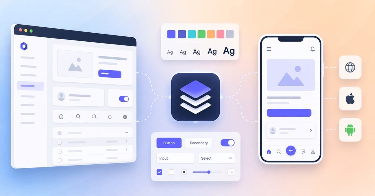
A design system that started on the web rarely maps cleanly onto mobile. This post traces what carries over, what breaks, and how to keep one source of truth across both.
If you've worked on more than one frontend project inside the same company, you've probably lived the problem a design system solves. Two teams ship a "primary button." They look almost the same. Almost. One has border-radius: 6px, the other 8px. One uses #0057FF, the other #0066CC because someone eyeballed it from a screenshot. Multiply that by every color, spacing value, input, modal, and toast across web and mobile, and you get drift: a product that technically works but feels like it was assembled by strangers who never spoke to each other.
A design system is the discipline (and the code) that stops this from happening. This post walks through the whole thing: the problem, the reasons to invest, what a real project looks like on disk, the tech stack, and the concepts worth understanding — with a specific eye on the hardest part, going from web to mobile.
What problem is a design system actually solving?
It's tempting to say "consistency," but that undersells it. A design system attacks four problems at once:
1. Visual and behavioral drift. Without a single source of truth, every design decision gets re-made, slightly differently, everywhere it's used. A design system makes each decision once and distributes it.
2. Wasted effort. Every team that rebuilds a date picker, a dropdown, or a form field from scratch is paying for work another team already did. That's not just initial cost — it's a permanent maintenance tax, because now there are five date pickers to keep accessible, tested, and on-brand.
3. The design–development gap. Designers work in Figma, developers work in code, and the two representations quietly diverge. A button's hover state in the design file stops matching the one in production. A good design system closes this gap by making design and code reference the same underlying decisions.
4. Cross-platform incoherence. This is the one that gets sharp when you add mobile. A user who moves from your website to your iOS app to your Android app expects the same brand, the same interaction language, the same feel. Three separate codebases with three separate style definitions guarantee they won't get it.
The mental model I find useful: a design system is a shared vocabulary plus a shared implementation. The vocabulary (names, patterns, guidelines) can be identical across platforms even when the implementation differs — a PrimaryButton in React, a PrimaryButton in SwiftUI, and a PrimaryButton in Jetpack Compose can share a name, an API shape, and a set of design values while being three completely different pieces of code underneath.
Why you should use one (and when you shouldn't)
The honest answer to "should I use a design system?" is it depends on scale.
You should invest when you have multiple products or platforms, more than a couple of teams touching UI, a need for theming (dark mode, white-labeling, multi-brand), or a product you expect to grow for years. In those situations the payoff is real: faster delivery (change once, propagate everywhere), fewer bugs (one battle-tested component instead of many ad-hoc ones), stronger brand identity, and a much cheaper path to things like accessibility and theming because you solve them in one place.
You probably shouldn't build a full system when you're a solo developer or a single small team on a single-platform product that isn't changing much. A shared theme.ts and a folder of components is a design system in miniature, and that may be all you need. The overhead of tokens pipelines, governance, and versioning only pays off once the coordination cost it removes exceeds the cost of running it. Building the machinery too early is a classic way to spend months on infrastructure nobody needed yet.
A useful rule of thumb from the industry: if your design decisions change daily and the system is still in flux, don't build a pipeline yet — define your values in one place and update platforms by hand until things stabilize. Automate once the thrash slows down.
The core concept: design tokens
If you learn one thing from this post, learn tokens. They are the atom of a cross-platform design system.
A design token is a named design decision stored in a platform-agnostic format — usually JSON. Instead of #0057FF scattered across a hundred files, you have color.brand.primary defined once. The value lives in one place; every platform imports a generated version of it.
The reason tokens matter more on mobile than anywhere else is the toolchain split. A web dev writes color: var(--color-brand-primary). A native iOS dev needs a Swift constant. A native Android dev needs a Kotlin value or an XML resource. React Native needs a JS object. Tokens let you author the decision once and transform it into each of those formats automatically, so a brand color change is one edit and one pipeline run, not a coordinated multi-repo release with a typo waiting to happen.
The three-tier token model
Mature systems layer tokens so that meaning and raw values stay decoupled:
| Tier | What it is | Example | Who consumes it |
|---|---|---|---|
| Global (primitive) | Raw values with no semantics — your palette and scale | blue.500 = #0057FF, space.4 = 16px | Alias tokens |
| Alias (semantic) | Decisions that reference primitives by purpose | color.action.primary → blue.500 | Components |
| Component | The most specific layer, scoped to one component | button.primary.background → color.action.primary | A single component |
The point of the layering is that you can retheme the whole product by repointing aliases without touching a single component. Dark mode becomes "swap the semantic layer," not "hunt down every color in every file." It also makes intent readable: color.action.primary tells you why a value is used, where blue.500 only tells you what it is.
The tokens pipeline
The tooling here has largely standardized:
- Style Dictionary (open-source, from Amazon) is the workhorse. It takes token JSON and transforms it into CSS variables, Swift, Kotlin, JS, Tailwind config — whatever your platforms need.
- Tokens Studio (formerly Figma Tokens) manages tokens on the design side, so designers edit the same source of truth developers build from.
- The W3C Design Tokens Community Group (DTCG) format is an emerging standard JSON schema for tokens. Authoring in an open format matters: it keeps you portable and stops you getting locked into a vendor's proprietary token store.
A typical flow: tokens are authored (in Figma via Tokens Studio, or directly in JSON), committed to git, and a continuous-integration (CI) job runs Style Dictionary to generate per-platform outputs that get published as packages (npm for web/React Native, and platform-native distribution for fully native apps). One edit, one pipeline, every platform updated.
One caution worth internalizing: a tokens pipeline is not free to run. Teams that maintain one report that the ongoing cost isn't the initial setup — it's the constant upkeep as you add a shadow type, handle a new dark-mode variant, or integrate a new tool. Budget an owner for it, don't treat it as fire-and-forget.
Anatomy of a typical design system project
Most modern design systems that span web and mobile live in a monorepo, because the whole point is sharing code across packages that would otherwise drift. A representative structure (React/React Native flavored, since that's the most common cross-platform path in the JS world) looks roughly like this:
design-system/
├── packages/
│   ├── tokens/            # JSON source + Style Dictionary config
│   │   ├── src/           # global / semantic / component token JSON
│   │   └── build/         # generated: css vars, ts, native outputs
│   ├── core/              # framework-agnostic logic, types, hooks
│   ├── ui-web/            # React components (web)
│   ├── ui-native/         # React Native components
│   ├── icons/             # SVG source + generated components
│   └── themes/            # light / dark / brand theme definitions
├── apps/
│   ├── docs/              # documentation site (often Storybook-driven)
│   └── playground/        # sandbox app for manual testing
├── .storybook/            # component workshop config
└── package.json           # workspaces + shared tooling
The key architectural idea is to push as much code as possible out of the platform-specific packages. Types, prop shapes, state logic, and hooks (the "how it behaves") can be shared; only the rendering (the "how it looks and lays out") should be platform-specific. A well-factored accordion, for example, shares its open/close hook, its item types, and its tokens across web and native, and only splits at the actual render layer.
Alongside the code, a real system ships three things that aren't code:
- Documentation — not just prop tables, but guidelines: when to use this component, when not to, accessibility notes, content rules. Auto-generate the mechanical parts (prop tables from types) and reserve human writing for decisions.
- Governance — who owns the system, how changes get proposed and reviewed, what the contribution process is, and how breaking changes are communicated. This is what keeps a system alive past its first year.
- A changelog and versioning policy — consumers need to trust that upgrades won't silently break them.
The tech stack
There's no single canonical stack, but here's the landscape as it stands, organized by layer.
Tokens & pipeline: Style Dictionary for transformation; Tokens Studio for design-side authoring; DTCG JSON as the interchange format.
Web component layer: You'll typically build on a headless/unstyled primitive library and style it with your tokens. Radix UI and React Aria give you accessible, unstyled behavior (focus management, keyboard nav, ARIA — the accessibility roles and attributes assistive tech relies on) so you don't reimplement a combobox's accessibility from scratch. shadcn/ui popularized the "copy the component into your repo and own it" approach on top of Radix. If you'd rather adopt than build, MUI, Ant Design, and enterprise systems like IBM Carbon, GitHub Primer, or Microsoft's Fluent 2 give you a full component set to customize with your tokens.
Styling: CSS variables are the natural runtime target for web tokens. Beyond that it's your call — CSS Modules, Sass, Tailwind (with a token-generated config), or CSS-in-JS. Given your stack (Vite, CSS Modules, Sass), a Style-Dictionary-to-CSS-variables output that your modules consume is a clean, low-magic fit.
Component workshop & docs: Storybook is the de facto standard for developing components in isolation, and it's the backbone of most documentation sites. It runs on Vite, supports React Native Web, and has first-class Expo integration for on-device native stories — so the same workshop can cover web and mobile.
Testing: Unit/interaction tests with Vitest and Testing Library; visual regression testing (Chromatic, Percy, or Playwright screenshots) to catch the subtle pixel drift that unit tests miss — critical for a system whose whole job is visual consistency; and accessibility checks (axe) wired into CI.
The web-to-mobile bridge — this is the interesting part:
- React Native (RN) + React Native Web lets you write components once and render to native views on mobile and the DOM on web. It's the foundation most JS cross-platform systems build on.
- Tamagui is currently the most compelling option for a truly unified RN + Web design system. It's a style library with an optimizing compiler that flattens components and extracts atomic CSS on web, giving near-native performance while sharing one component definition across iOS, Android, and web. It has typed style props, a built-in theming/token system, and plugins for Vite, Metro, Webpack, and Next. The trade-off is a steeper learning curve and some configuration friction (its compiler and the RN dependency-resolution quirks are real).
- Alternatives in this space: gluestack-ui (utility-first), NativeWind (Tailwind for React Native), and Shopify Restyle (a type-safe theming engine you build your own components on).
- Bit is another approach for managing and sharing individual components as versioned units across React and React Native projects.
If your organization runs fully native (SwiftUI on iOS, Compose on Android) rather than React Native — the two native stacks mapped out in The web developer's map to native iOS and Android — the sharing happens at the token layer rather than the component layer: you share names, APIs, guidelines, and design values, but each platform implements its own components. This is the model large systems like Fluent 2 and Salesforce Lightning use — shared semantic tokens, platform-specific component implementations that respect each OS's conventions.
That last point is the central strategic decision for web-to-mobile: how much do you share, and where do you draw the line? A single shared component tree (Tamagui-style) maximizes consistency and minimizes duplicate work, but couples your platforms and can fight against native platform conventions. Token-only sharing with independent native implementations respects each platform's idioms and gives teams autonomy, at the cost of building components three times. Neither is wrong — it depends on how much you value cross-platform parity versus per-platform nativeness.
| Sharing strategy | Cross-platform consistency | Native feel | Duplicate effort | Platform coupling |
|---|---|---|---|---|
| Unified component tree (Tamagui / React Native Web) | ||||
| Token-only + native impls (SwiftUI / Compose) |
All the important concepts, briefly
A few more ideas that come up constantly and are worth having crisp definitions for:
Atomic Design. Brad Frost's mental model for composing UI: atoms (button, input) → molecules (a labeled input) → organisms (a form) → templates → pages. It's a way to think about component granularity, not a rule you must follow literally, but the vocabulary is everywhere.
Headless / unstyled components. Components that ship behavior and accessibility but no styling (Radix, React Aria). You bring the look via your tokens. This separates the hardest-to-get-right part (interaction and a11y) from the part you want full control over (visuals).
Theming. The ability to swap the look without changing structure — dark mode, brand variants, high-contrast. This is what the semantic token layer buys you. If theming feels hard, it usually means your tokens aren't layered properly.
Component API design. The props are a public contract. Prefer a small, composable API (compound components — <Select><Select.Item/></Select>) over a giant prop soup. Once teams depend on your component, changing its API is a breaking change, so design it like a library, because it is one.
Accessibility (a11y). A design system is the best possible place to solve accessibility, because you fix keyboard navigation, focus management, ARIA roles, and contrast once and every consumer inherits it. This is one of the strongest arguments for a system: a11y stops being per-feature heroics and becomes a default.
Visual regression testing. Because the system's job is visual consistency, you need tests that actually look at pixels. Screenshot diffs across components and states catch the "the shadow changed by 1px in dark mode" bugs that no assertion would.
Versioning & semantic versioning. Publish your packages with semver and mean it. Breaking changes get a major bump and a migration note. Consumers need to upgrade without fear.
Governance & adoption. The most common cause of death for a design system isn't bad code — it's lack of adoption. Teams won't use a system they don't trust or can't influence. Clear ownership, a real contribution process, backward compatibility, and involving consuming teams in the roadmap are what keep it alive. A beautiful system nobody uses is worse than no system, because you're paying to maintain it and still living with drift.
Design–code parity. The end state everyone's chasing: the components in the design tool and the components in production reference the same tokens and behave the same way. Approaches like code-backed design tools aim at this, but even without special tooling, a shared token source gets you most of the way.
How to actually adopt one
If you're starting from an existing product (which is the normal case), don't try to build everything before shipping anything. A workable order:
- Audit what you have — inventory the colors, spacing, type styles, and components already in the wild. You'll find the drift, and it motivates the whole project.
- Extract tokens first. Pull your primitive and semantic values into a token source before touching components. Tokens are the foundation everything else references.
- Build a few high-value components — the button, input, and whatever you use most — on top of the tokens, in a Storybook workshop. Prove the model works before scaling it.
- Add the pipeline once you have real consumers, so token changes propagate automatically.
- Layer in governance and docs as adoption grows and more teams start contributing.
- Bring in mobile deliberately, choosing your sharing strategy (unified component tree vs. token-only) based on whether you're on React Native or fully native.
Start small, ship early, expand under real demand. A design system is a product with internal customers — treat adoption as the metric that matters, not completeness.
Common pitfalls
- Token overload. Creating a token for every conceivable value means you spend more time managing tokens than designing. Tokens should encode decisions, not every possible number.
- No naming convention. Without consistent naming, nobody can find or trust the right token. Agree on a scheme early (
category.property.variant.state). - Building the machinery too early. Pipelines and governance for a system with two components and one consumer is pure overhead.
- Design–code drift. The moment your design tool and code diverge, teams lose trust and route around the system. Keep them pointed at the same tokens.
- Treating adoption as automatic. It isn't. If teams aren't using it, the system is failing regardless of how good the code is.
The one-paragraph summary
A design system solves drift, duplicated effort, the design–code gap, and cross-platform incoherence by making design decisions once and distributing them. The atom is the design token — a platform-agnostic value, layered into global/semantic/component tiers, transformed by tools like Style Dictionary into whatever each platform needs. On top of tokens you build accessible, themeable components, developed in a workshop (Storybook), tested for visual regression, versioned like a library, and kept alive by governance and adoption more than by code. Going from web to mobile forces the central decision: share one component tree (Tamagui / React Native Web) for maximum consistency, or share only tokens and implement natively (SwiftUI / Compose) for maximum platform-nativeness. Start with tokens, ship a few components early, and grow the system under real demand rather than building all the machinery up front.
References
- Design Tokens Community Group — W3C — the group standardizing the design token format across tools.
- Storybook — the frontend workshop for building and documenting components in isolation.
- Material Design 3 — Google's design system and guidelines for Android and beyond.
- Human Interface Guidelines — Apple — Apple's design standards across its platforms.